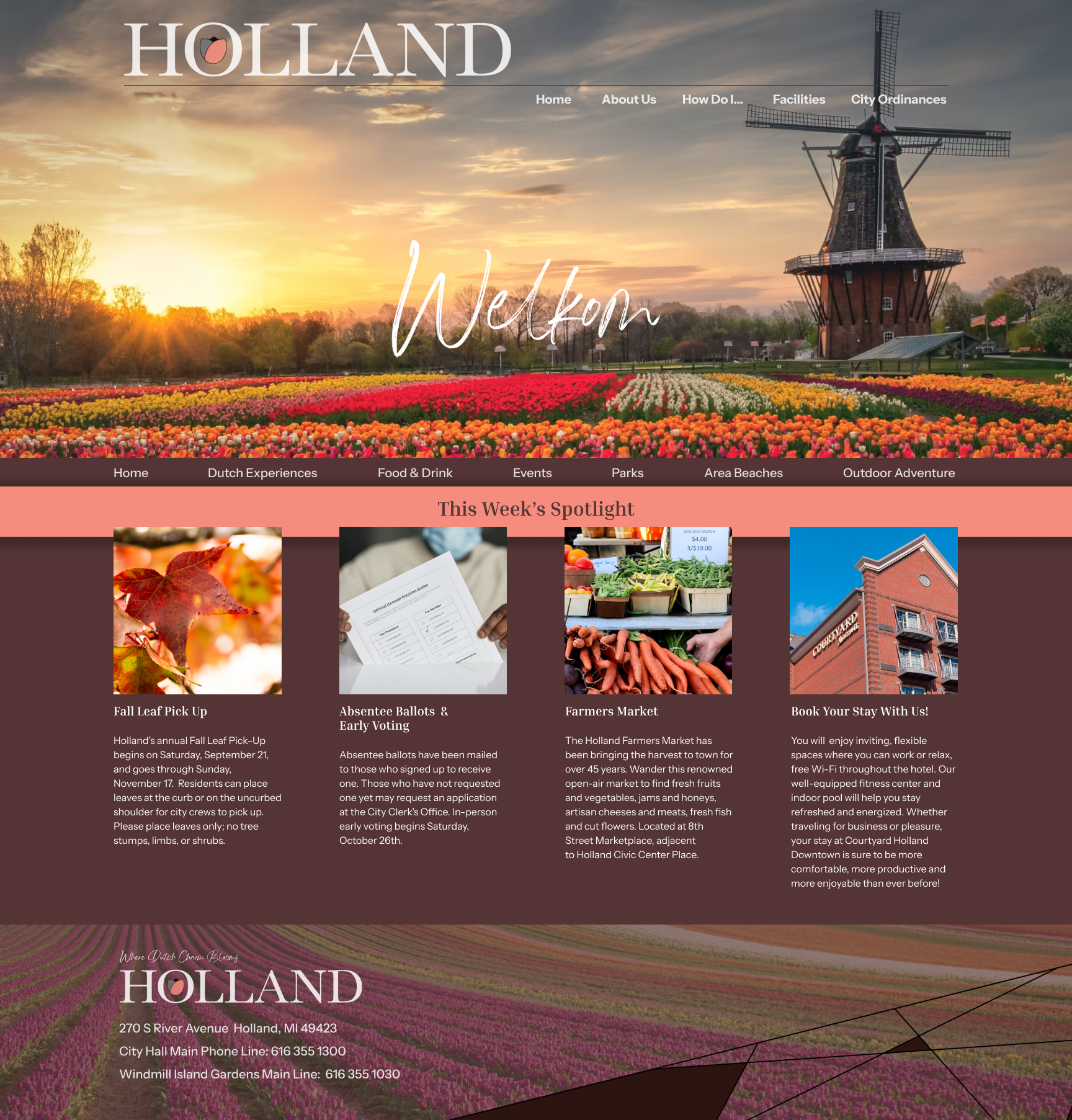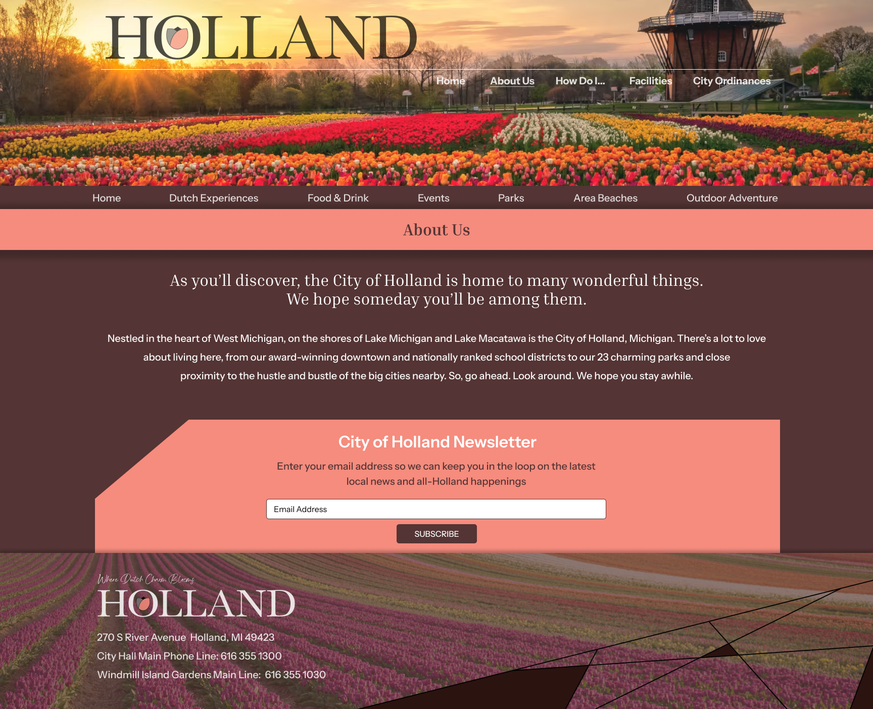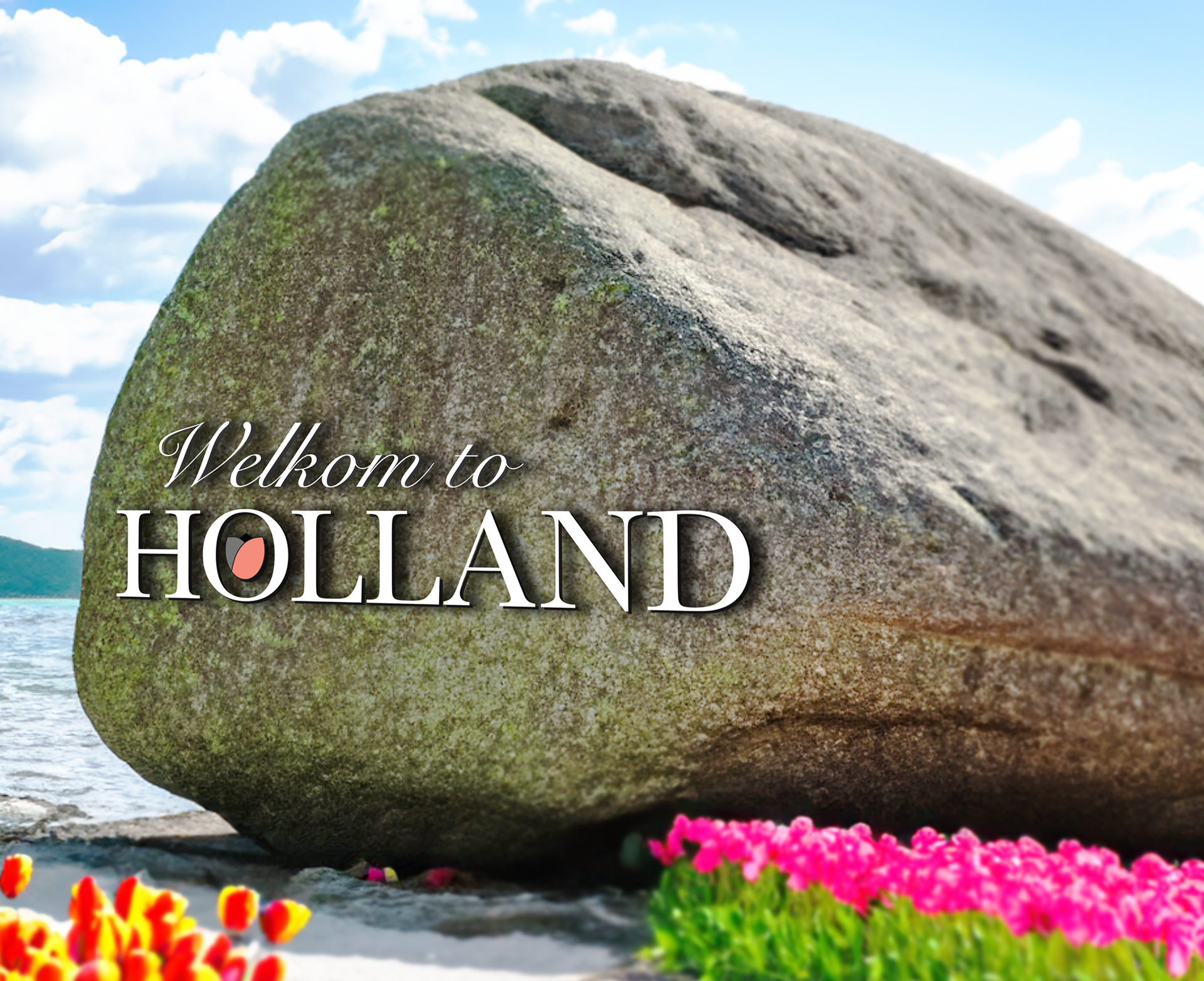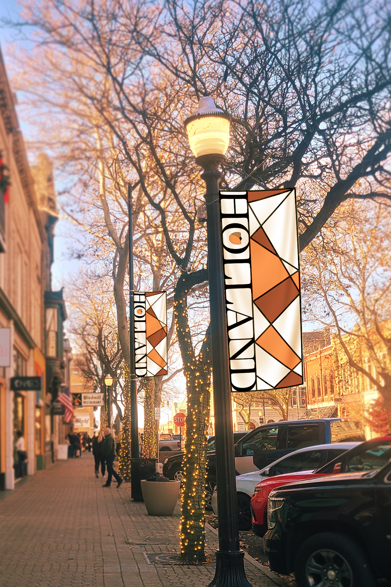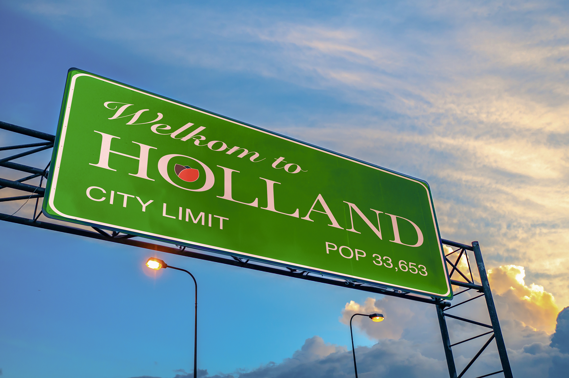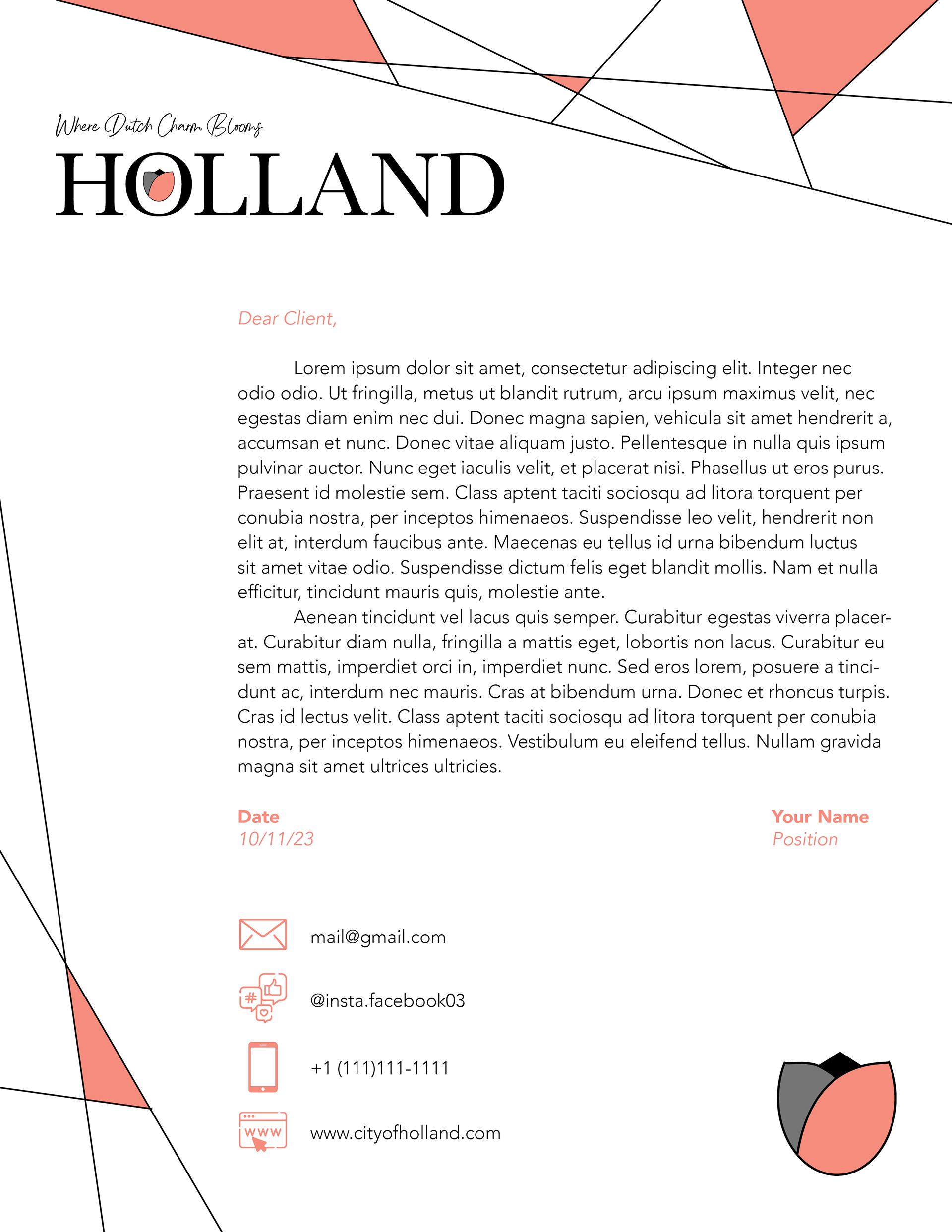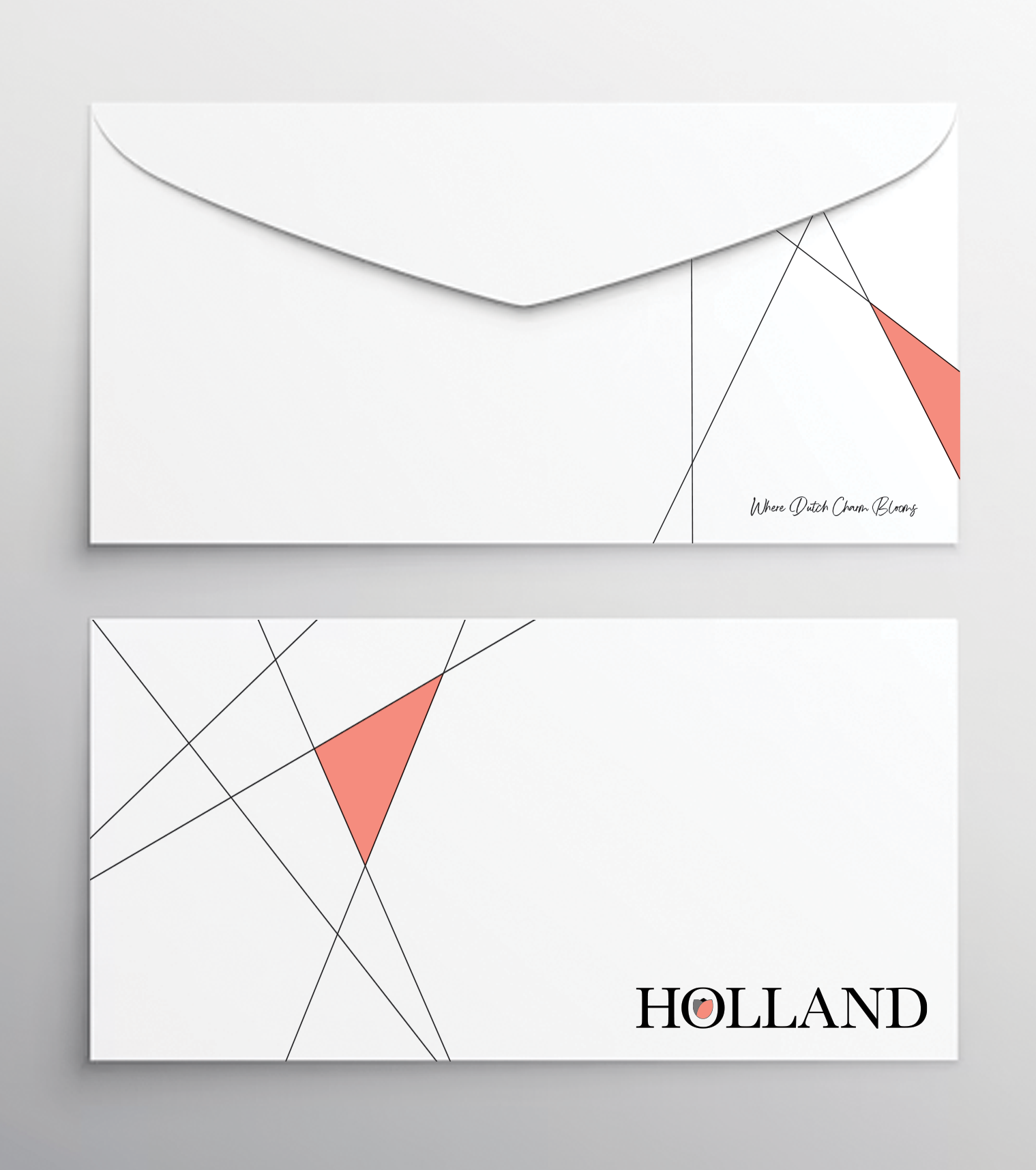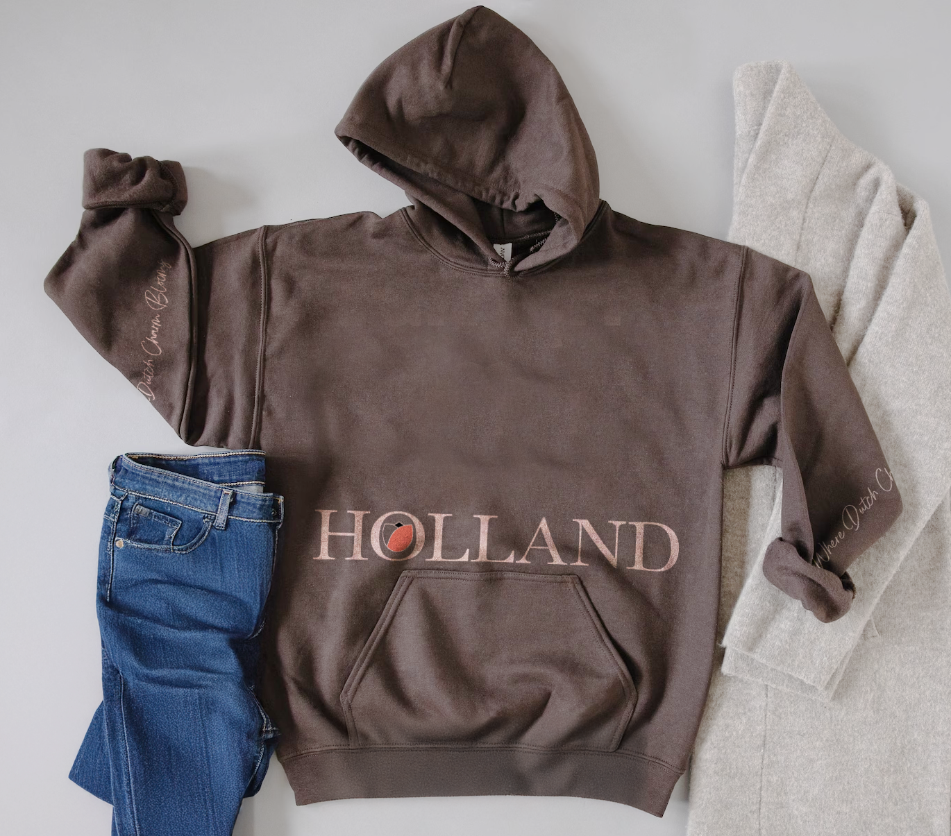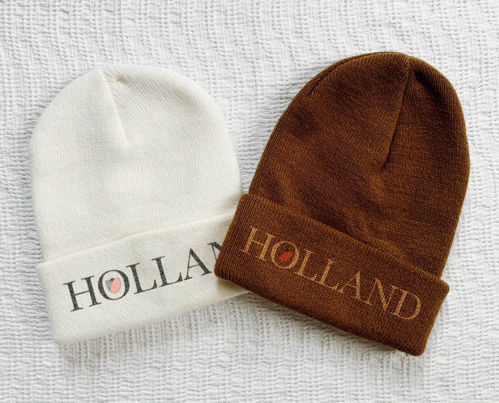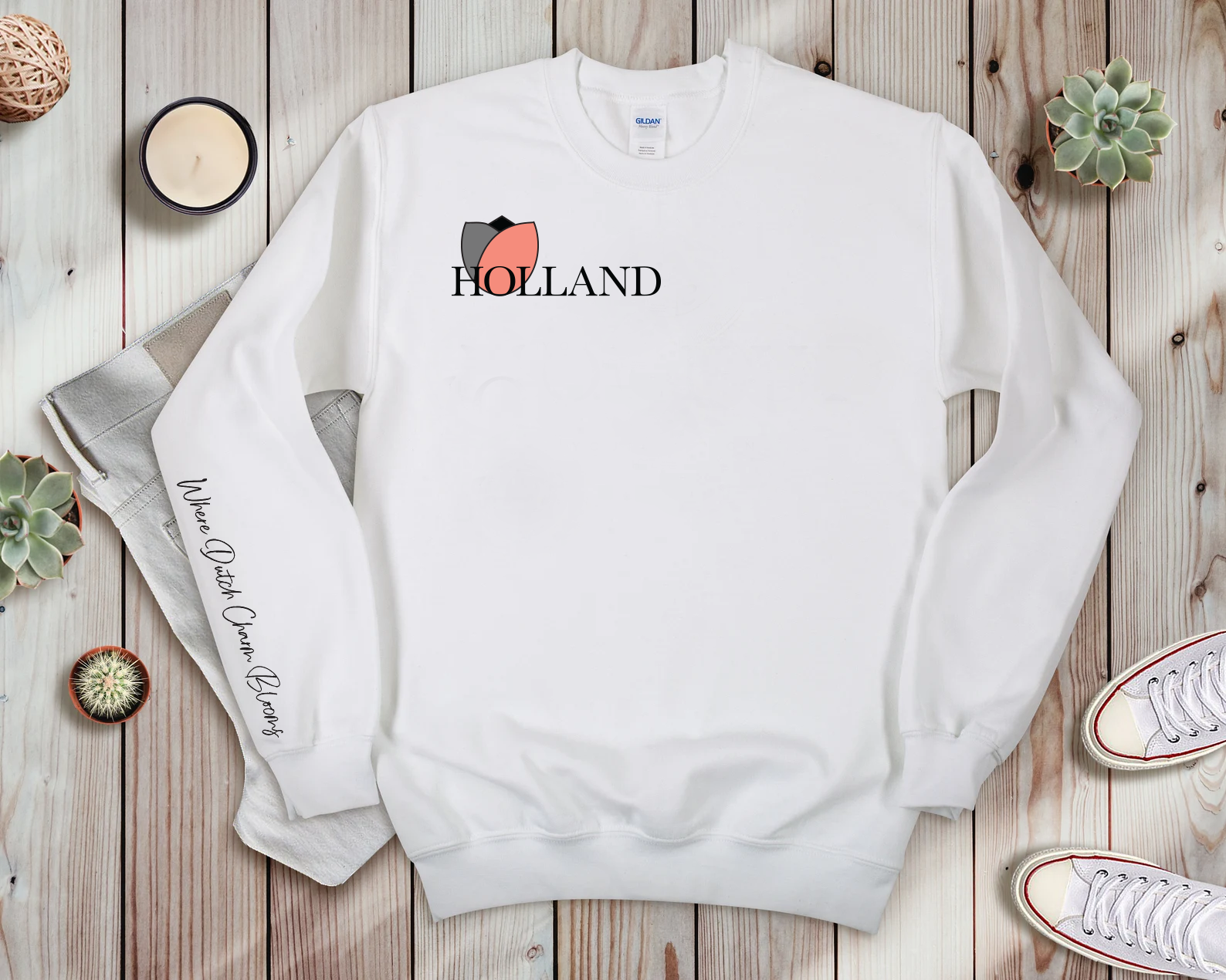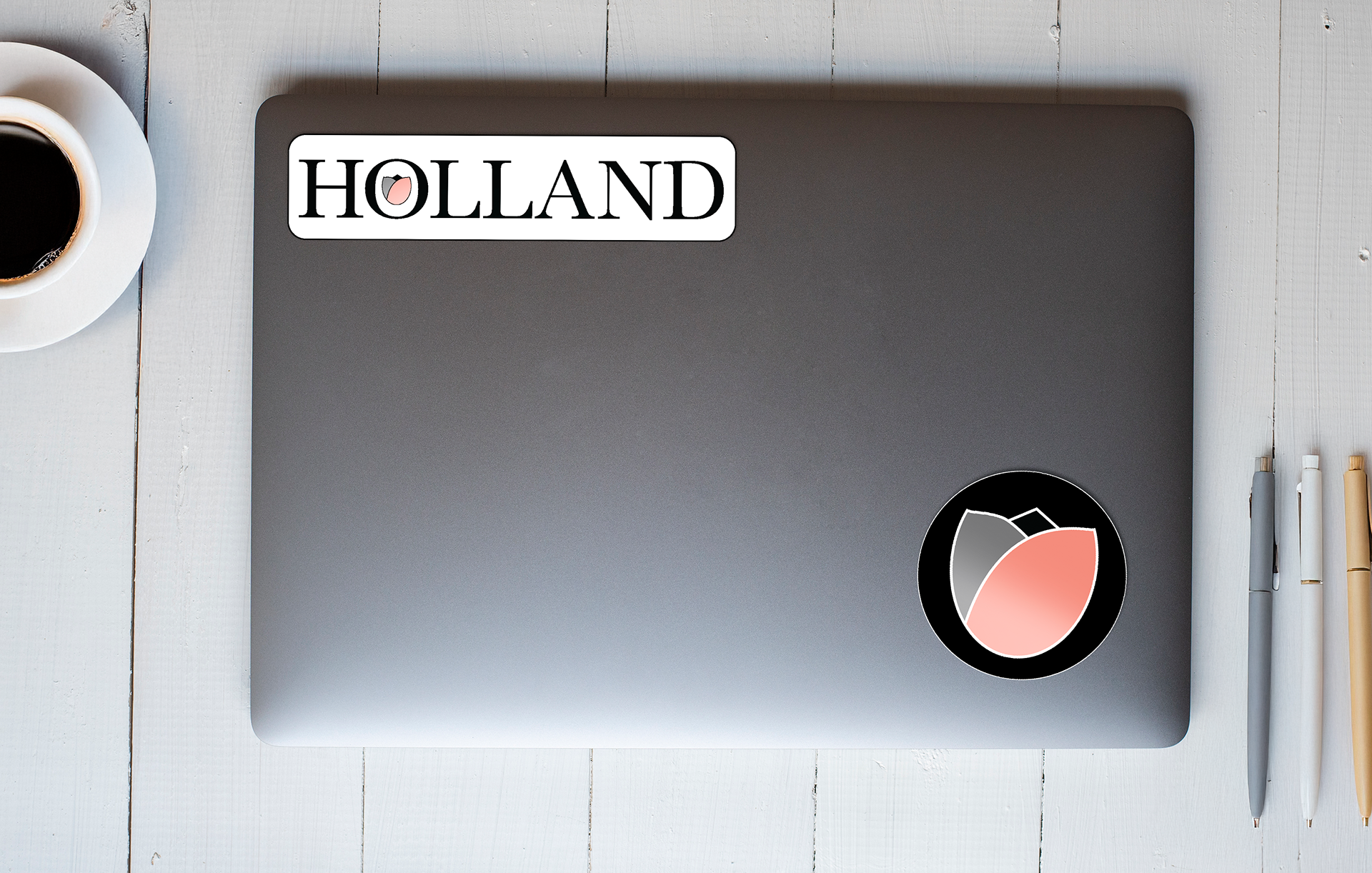

City of Holland – Rebrand
This rebranding campaign aims to move Holland’s current brand appearance away from being tourist-motivated, and towards a more inviting place to live. Holland’s original look communicated a tourist-branded city, rather than a home or a place to raise a family. This rebranding articulates the charm and the cleanliness of Holland, accentuating why Holland is an even better home than it is a tourist destination. The design focuses on sharp lines and a bold coral orange to create a comforting and structured appearance, relating to the lifestyle in Holland. The ‘Welkom’ phrase is carried over from Holland’s original branding, keeping its Dutch charm as a focal point of the brand—the tagline ‘Where Dutch Charm Blooms’ also resonates with this message.